SCHMITZ
2024
RESEARCH
STRATEGY
BRAND IDENTITY
LOGO REDESIGN
ART DIRECTION
WEBDESIGN
Schmitz Furniture Design Studio specializes in creating exquisite, bespoke furniture, kitchens, and bathroom pieces. Renowned for his meticulous craftsmanship and innovative designs.
Challange:
Schmitz Furniture Design Studio’s existing brand image did not fully convey the premium quality and unique aesthetic of its furniture creations. There was a need for a comprehensive rebranding to reflect the sophisticated, minimalist nature of their work and enhance the overall perception of their brand.
SOLUTION:
I developed a refreshed brand identity that captures the essence of Schmitz’s craftsmanship and design philosophy. This involved refining the logo, brand visuals, and digital presence to highlight the elegance and timeless quality of Schmitz’s furniture designs. As part of the rebrand, I conducted a comprehensive photo shoot of older projects, including some completed a decade ago. The photography, guided by meticulous art direction, captures the enduring quality and aesthetic appeal of Schmitz’s work. This visual update reinforces the brand’s commitment to excellence while providing a modern and cohesive brand experience.
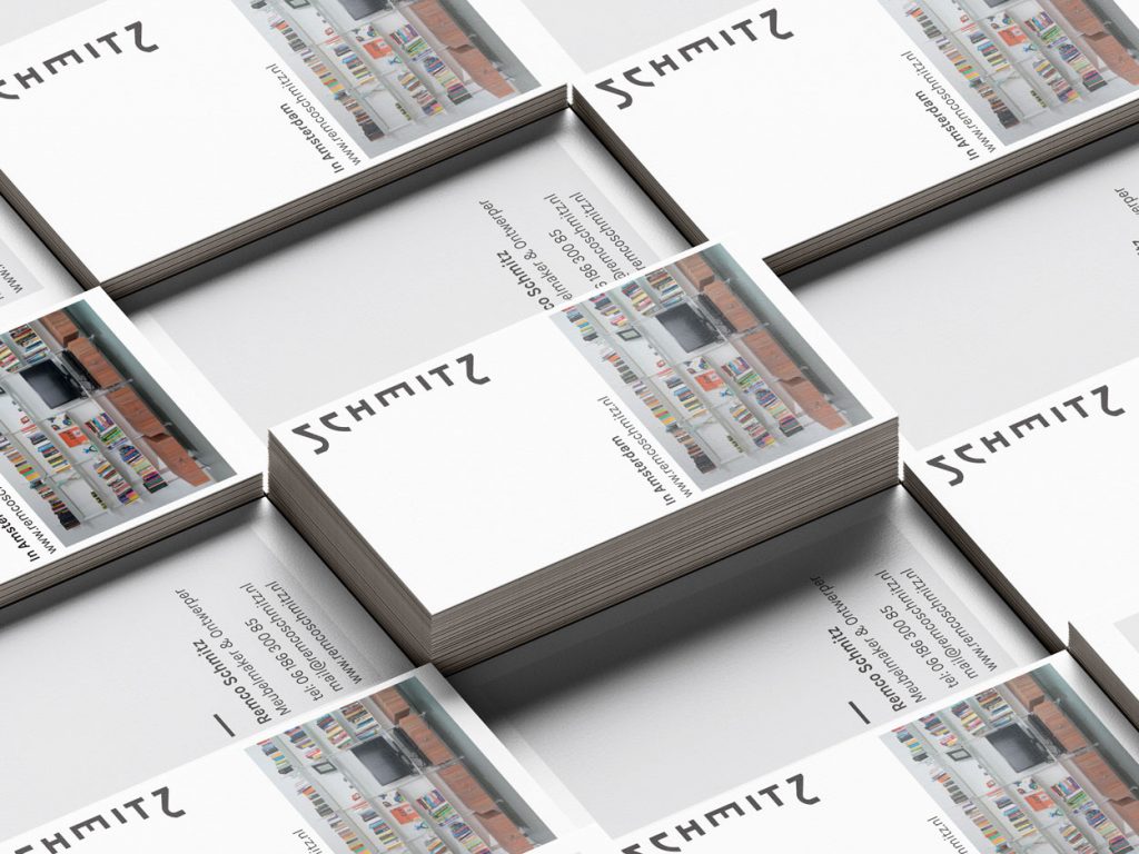

The studio’s new brand identity features a minimalist logo that reflects the simplicity and sophistication of Schmitz’s designs.
Logo update:
The new logo features a bold yet minimalist design, prominently showcasing the letters “S” and “Z.” This sleek and refined aesthetic captures the essence of Remco Schmitz’s meticulous craftsmanship, striking a balance between boldness and simplicity.
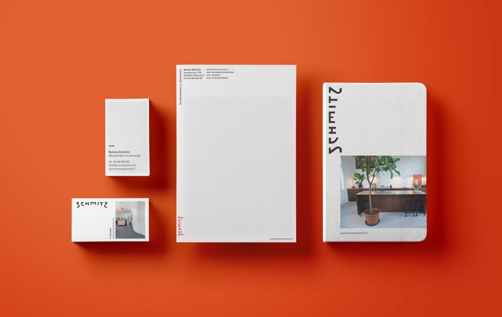
The Brand
The updated brand identity includes a minimalist logo that reflects the elegance and simplicity of Schmitz’s designs. This new visual identity is consistently applied across all brand materials, including letterheads, websites, and business cards, providing a modern and unified look.
Projects showcased on business cards, the website, and social platforms are distinguished by unique identifiers such as “Aan de gracht,” “Aan het water,” and “Op de heuvel.” These designations not only specify project locations but also reflect Schmitz’s thoughtful integration of his creations within their environments.
In developing the brand identity, I emphasized a “full concentration” approach, ensuring a harmonious interplay of visuals, design elements, and typography. This art direction underscores Schmitz’s commitment to detailed craftsmanship and cohesive design, allowing each piece to both stand out and blend seamlessly with its context, thereby creating a unified and sophisticated brand experience.
Visuals:
The brand’s visual elements, including the color palette and typography, were carefully curated to convey a sense of sophistication and precision. The focus was on creating a seamless interplay of visuals and typography that underscores Schmitz’s commitment to high-quality craftsmanship.


